
OVERVIEW
MediBuddy is India’s largest and most comprehensive one-stop health benefits management platform used by more than 1 million people across India. It provides its users with 24×7 access to specialist doctors via video calls, doorstep medicine delivery, lab tests, mental health support and other integrated healthcare services.
This project focuses on optimizing lab test search and checkout to reduce drop-offs in the flow. My role involved identifying pain paints, finding opportunities, and ideating possible solutions.
Optimizing search and checkout for lab tests on MediBuddy
Tags: User Research, Product Design
Project Time: 8 Weeks
Team: UX Lead: Kritika Vishnoi
UI Developer: Indraneel KD
UX Design & Research: Me
My Role: Research Lead, Design

Why this redesign?
CONTEXT
The MediBuddy app was undergoing a redesign to accommodate the large number of users that were using the service. As part of the redevelopment, lab testing services were being looked into, since there was a lack of users using the app to book lab tests even though thousands of tests were issued by doctors using the platform.
Additionally booking health check packages (bundled lab tests) was going to be introduced. The re-design aimed to merge lab test and health package booking onto a single landing page and create a unified search & results page.

FINAL DESIGN
Optimized Lab Test Search

Optimized Lab Test Search


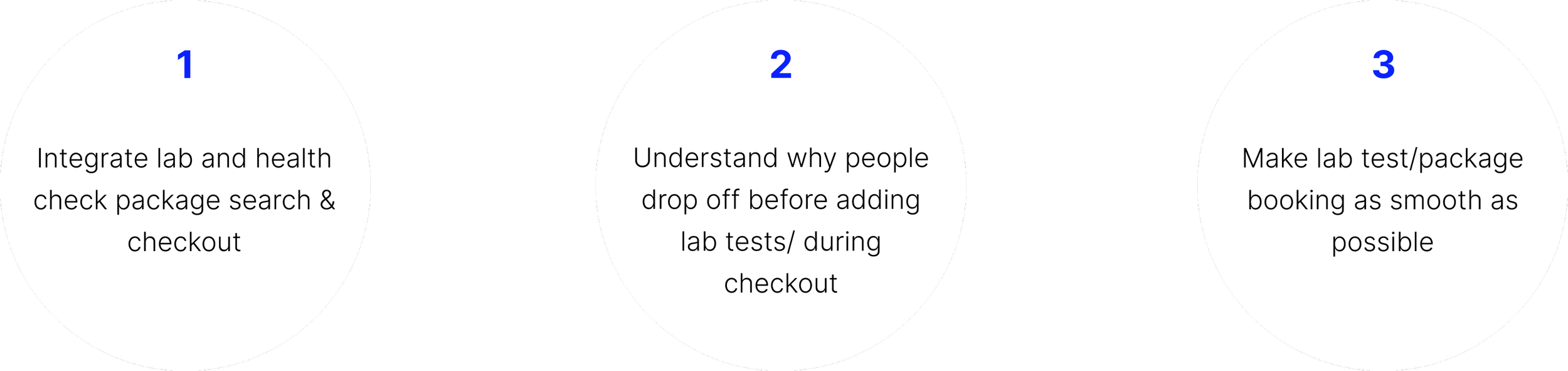
GOALS
Some of the Requirements that started the project
PROCESS
Segmenting the project into 3 phases
We had a limited time frame to bring the project into production, to ensure we utilized our time the project was phased into three stages, the first phase was the research & design of search, then checkout, and the final phase was refining the UI and screens for engineering teams.
The designs highlighted in this case study are only the screens that were designed by me in phases 1 and 2.


PROBLEM STATEMENT #1
How do we optimize search for lab and health check packages
USER RESEARCH
What is the search & purchase behavior of an individual looking for lab tests?
To understand what an individual looks for when they book a lab test, we conducted interviews with 10 users, here are some highlights from those discussion

What are the pain points in the current design?
We conducted 15 user tests with current MediBuddy users to understand what the issues with the existing design were

Providing too many details prevents a decision from being made
Search results for lab tests displayed cards with lab centers as the headline. When faced with 100s of lab test centers to choose from, the user was confused:
“how do I know which [option] is the best, cheapest, and near me?”

SEARCH ANALYSIS
Reviewing existing search & results
One of the main goals for the project was to create a single search for both lab tests and health check packages. A challenge would be to display search results that fell into two categories either lab test or health check.
I conducted a review of existing search designs that are used for multiple categories of search queries, Since the search results will now display both lab tests and health packages, I wanted to understand how to show results in a clear way.

IDEATION
How much is too much?
From our insights, we realized we had to cut down on the information in the search results cards, but at the same time, we needed to display info in the results in a way where a user would be encouraged to add the lab tests to the cart.
After ideating and iterating and testing the project was further scoped by the PM to remove lab test center choice from the booking flow. All lab tests would be treated as home sample collection (meaning a phlebotomist would come to your house to collect the sample) and the lab center visits would only be suggested when the lab test had special requirements. This change removed the choice of test center and location.


NEW SEARCH ARCHITECTURE
Making search more intuitive
The information architecture maps the way the search behaves in case of no search query, partial search query, and completed query.
FINAL DESIGN
With the new search design, users are able to search for lab tests and health check packages from the same search bar. The unified search results enable MediBuddy to also upsell packages containing searched lab tests.
Toggles help segregate the search results, but also enable quick access to the different categories.

The new design makes to search and selection simple
PROBLEM STATEMENT #2
How do we encourage and simplify checkout of lab tests?
The flag at the top of the hill is missing
From user testing, we found that the existing design doesn’t highlight how many steps the checkout process has.
We realized by adding a step counter, users moving through checkout are able to estimate how long the process would take and feel more inclined to finish the booking.
We experimented with a few different step counter designs, as seen on the right.
INSIGHT #1


limiting opportunities for re-evaluation of purchase
INSIGHT #2
Booking a lab test is a necessity for most users, by simplifying processes and limiting opportunities to move back in the flow, we were able to increase the chances of an individual completing a booking.

Putting it together

IMPACT
Search & check out time cut by 20%
With the improved search and checkout flow the time taken to add tests and check-out was reduced by 20%, and individuals did not have a hard time adding lab tests into the cart since multiple decision points had been removed.
With tests in the cart, users moved into the checkout flow faster and felt more inclined to complete checkout. Once within the checkout funnel, the progress tracking bar helped set expectations and served to reassure users that the booking was almost complete.
Some parts that required further testing was the addition of an intermediary screen showing the lab test price. Since there was some resistance to not even providing lab test prices in the search screen.
